display : flex
Flex 中分為外容器與內元件
Flex 外容器屬性:
●display
●flex-flow
●flex-direction
●flex-wrap
●justify-content
●align-items
Flex 內元件屬性:
●flex
●flex-grow
●flex-shrink
●flex-basis
●order
●align-self
外容器
先設定 display: flex | inline-flex 才可使用下述大部分屬性
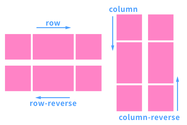
flex-direction
決定內元件排序方向的重要屬性
flex-direction: row | row-reverse | column | column-reverse;
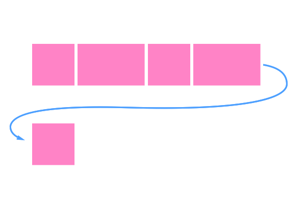
flex-wrap
超出範圍時是否換行的屬性,分為換行、不換行、換行時反轉。
flex-wrap: nowrap | wrap | wrap-reverse;
flex-direction & flex-wrap 的縮寫
flex-flow: < 'flex-direction'> || <'flex-wrap'>
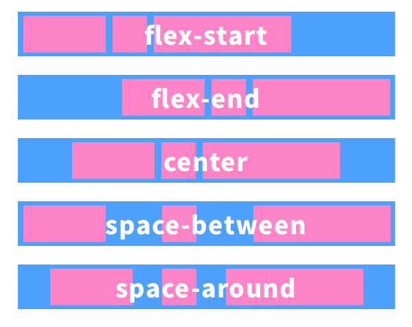
justify-content: flex-start | flex-end | center | space-between | space-around;
align-items: flex-start | flex-end | center | baseline | stretch;
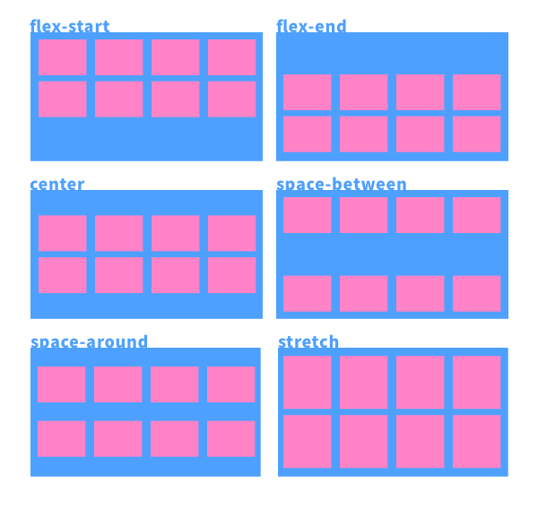
多行版本 :
align-content: flex-start | flex-end | center | space-between | space-around | stretch;
內元件
flex
flex 是縮寫,裡面依序包含三個屬性 flex-grow、flex-shrink 和 flex-basis,如果只設定一個則是 flex-grow。
flex-grow: 元件的伸展性,是一個數值,當空間分配還有剩餘時的當前元件的伸展性,預設值為 0,如果設置為 0 則不會縮放。
flex-shrink: 元件的收縮性: 元件的伸展性,是一個數值,當空間分配還不足時的當前元件的收縮性,預設值為 1,如果設置為 0 則不會縮放。
flex-basis: 元件的基準值。
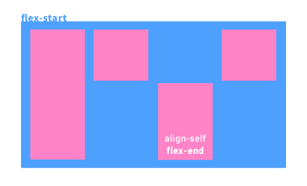
align-self
align-self 可以調整內元件交錯軸的對齊設定,且可以個別設定單一元件的值。
Order
可以重新定義元件的排列順序,順序會依據數值的大小排列。